
Pile Up is a desktop to-do app whose goal is to stress you out.
I was annoyed by my own habbits, abusing to-do apps as a burial ground for tasks. So long as it was somewhere I didn’t have to think about it. This lead to piles of task left undone or quietly moved into the “someday” section never to be seen again. To attempt to solve this I have been moving to more and more minimalist productivity software, the latest of which is a simple list in a markdown file. However, even this simple system could not escape the same fate.
I resolved that what I needed was a to-do which indicated to me the amount of stressed out I should be. Over the next few weekend I designed and developed Pile Up a to-do app which stresses you out.
Problem
The user needs to get things done. They have more things to get done then they can effectively store in brain memory so they have to use external memory. However it is important that they do not loose sight of the bigger picture and use external task memory to obsucate how much they have on. One solution might be a tool for storing tasks which also lets them know when they have a lot of tasks. This might get some of the way, however presentation of information and onboarding of that information are not the same. The user needs to feel when
for reference I present a page from a very old note book at a time when I could feel I had a lot on.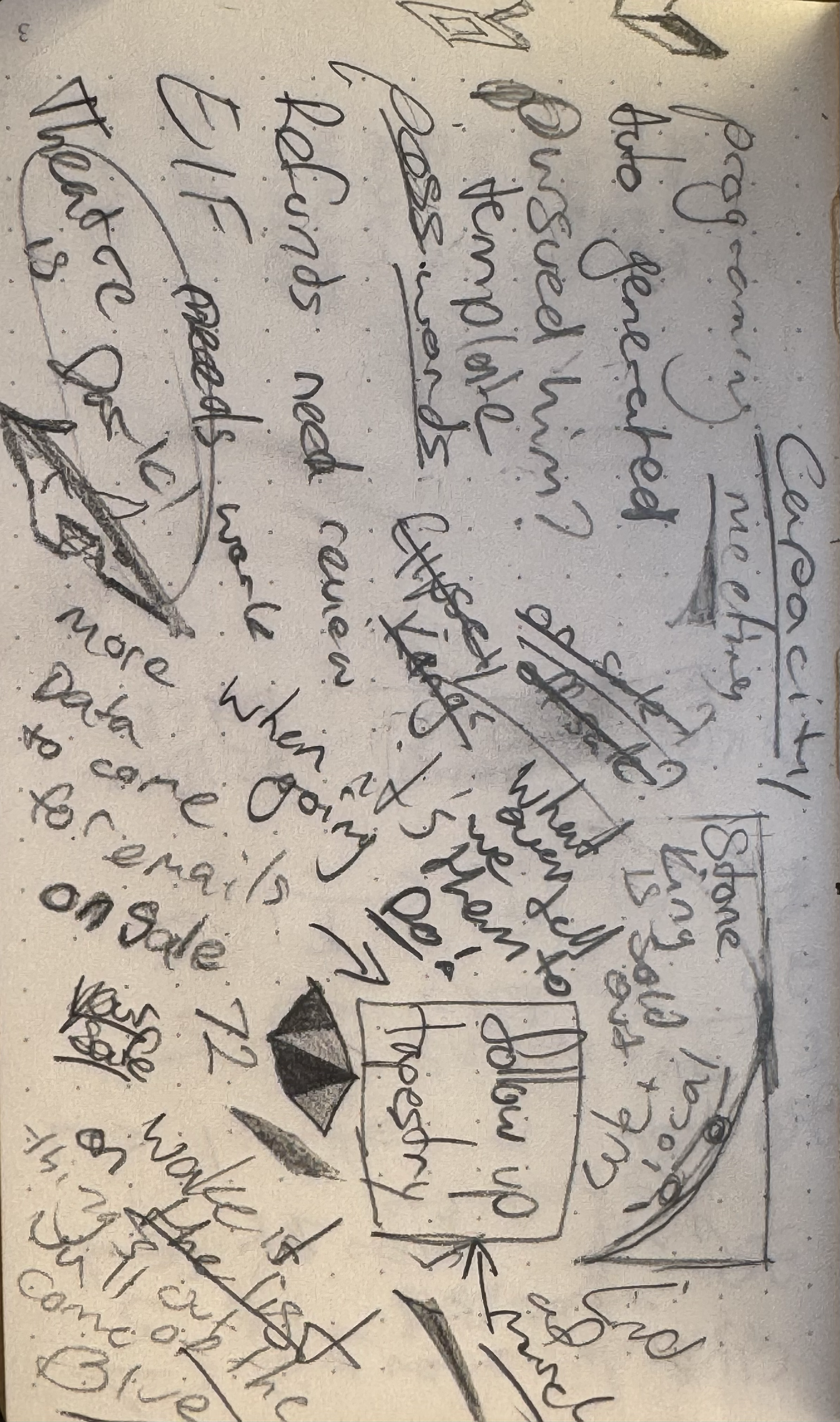 A deeper solution may be to make tool slightly less usable or visually more striking the more tasks are on it. Hostile design to reenforce user behaviour.
Product
Pile up is a hyper minimalist productivity and utility tool. It has a place for tasks, and place for scratch notes and a super simple pomodoro timer. It’s intention is to be second monitor princess supporting from the side-lines. It is designed visually to ensure that you know when it needs your attention.
Stress
one of the core features of Pile Up is the visualisation of stress. Many productivity apps will take the burden of task storage off your brain. As a result they also take away your understanding of how much is piling up. Pile Up, while still enabling you to offload your brains responsibility of remembering tasks, gives you a clear sense of when you have taken on too much.
This is done through colour and animation. As the user add more and more incomplete tasks to the list, Pile Up gets more and more upset. At the beginning, when you have more then 5 tasks incomplete, Pile Up will make each task
Then, as the user continues to add more incomplete tasks, and has more then 7. Pile Up will get even angrier. At this point the user has more tasks then could retain an understanding of. It is now critical that the user understands the severity of the situation and so the tasks will begin to wobble. Almost as if they could fall at any moment.
From here Pile Up tasks will become redder and wobble more viciously with every new incomplete task. At 14 incomplete tasks Pile Up will shake even more violently with another transform axis into the mix. At this point looking at the interface is . It is clear that the user must complete some tasks before adding any more.
Hopefully the user has not taken on too much and can complete the tasks super quickly. The process which is defining the “Stress” responds immediately. This is to ensure that there is a immediate reward for doing so. Pile Up takes away stress as quickly as you can
Notes
The scratch notes are a simple place to jot down important pieces of information which may not necessarily be tasks. The first and most important use case is the “let me grab a pen” situation. In this case the use can at all times have a post it note at the ready. Going slightly further then this however, pile up has This is implemented using markdown-rs a rust markdown parser running on the tauri backend. It is a very seamless process and insanely fast. I nearly have a full interactable and content editable version (a la obsidian) of the scratch notes working. Unfortunately it is not quite ready. , meaning that the scratch notes can become a tool for presentations or for .
Pomodoro Timer
The pomodoro timer is a feature to try to reduce the need for desktop app clutter. By adding all the productivity utilities in a single place with the same minimal design choses. The Pomodoro timer only has a single control. Once it is turned on it will start a 25 minute timer. will be loaded and the timer paused. This timer can then be started again by the user. This pattern repeates twice before a longer 25 minute “big break” timer is loaded. Once all times have been complete the timer is removed and a new session can be started.
The intention here is provide only the true bare necessities of functionality. There are no custom timers or skipping functionality. Only what is 100% required to utilise the pomodoro method.
Styling
As the main feature of the app is to visualise stress, it is important that the rest of the design felt tranquil. This philosophy mixed with the hyper minimal feature set means that it is the details which matter most. Small alignment problems and colour inaccuracies would be frustrating, especially after working so hard to clear the stress. Here I’ve use the google icon set, and styled with tailwinds grey colours for the most part, this grey pushes quite blue and nullifies some of the red when dealing with a lot of stress. Of course light and dark modes .
User Experience
The main thinking behind the user experience is the intended desktop location. The goal for this app is to a utility and not a main work zone. As a result interaction points needed to be centralised and functionality specific. With a very small feature set this is not too challenging. The outcome is that main interactions turn “on” a feature and then all sub-features should be localised after that. This is reenforced with the capacity to effect the window in a way not utilised in web dev as much. When the user turns “on” the note section, the window becomes larger, giving very specific indication as to what has changed and . The same is true in the reverse. This means that the user always has a wysiwyg perspective on the features available.
There is a specific lack of configuration throughout the app. This is to reduce the productivity apps desire to be a custom solution, leading to a never ending configuration loop and ultimately distraction from the users goal of Which… if I think about it, is good productivity app design, but has not helped me in the slightest.
Feature Selection
In terms of feature selection, the starting point was the to-do section. From there the thinking revolved around what a user will need to reduce the to-do list. Specifically a place to process information (scratch notes) and a way to reenforce focused work. I’ve selected these ones as they are the ones I use. While this is a useful design and delivery case study it is also just a tool I wanted to use. Once the features had been selected the process was to attempt to understand the specific use case of the user and only enable those interactions.
Process
The design process for this one was pretty loose. Because this was also a technical exploration of web frameworks in first Electron, which I found to be pretty slow and heavy and then Tauri which was a lot more fun if not slightly more limited I wanted to jump in straight away and see how much was viable. While the overall philosophies where thought through before beginning much of specific UI was worked out through rapid prototyping.
Key take aways
- Web frame works in desktop contexts are powerful, versatile and make the development process a breeze if you are familiar with them.
- The more “minimal” a design the more light is shone on the granular details.
- Size, shape, and spacing (in this case the window resizing) are incredably effective tools for effective user experience.
- Anti-design patterns are fun, working against the user can have effect thier behaviour in interesting ways.
- Opinionated designs are fun, but broader strokes jive with more folks. This may be a tool only I want to use.
Next steps
- Add crud operations to a basic database.
- User login and auth to enable persistent storage of tasks.
- A bunch of user testing to better understand if these design decision are effective.
- Quick web implementation using the same auth.